When it comes to user interface (UI) and user experience (UX) design, simplicity isn’t just a preference—it’s a necessity. A well-designed app should be intuitive and allow users to focus on the content, not on figuring out how to use it. Yet, even some of the most widely used platforms can make design choices that complicate the experience, such as YouTube's recent move to introduce a custom in-app Picture-in-Picture (PiP) mode on iOS.
The catch? System PiP—the standard, familiar PiP experience that integrates seamlessly with iOS—isn’t available for YouTube’s free users. Instead, they’re presented with YouTube’s own take on PiP, which is both difficult to navigate and visually jarring. This setup is a perfect example of why “keeping it simple” is key to effective app design.
The Problems with YouTube’s New In-App PiP
YouTube’s in-app PiP does not use the standard iOS PiP, leading to a number of inconsistencies and usability issues. Here are some key points where it falls short:
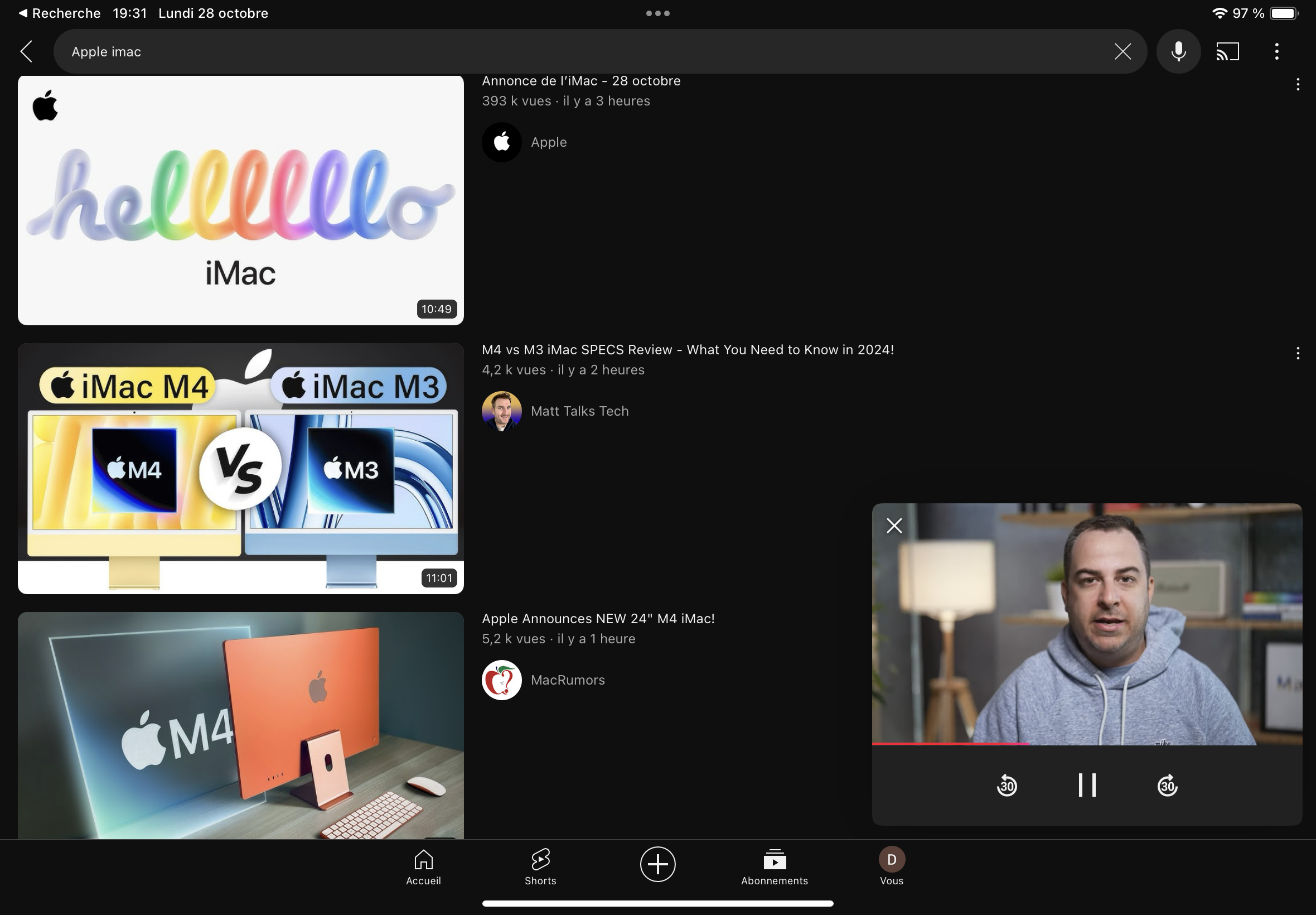
1. Smaller, Unmovable Video Window
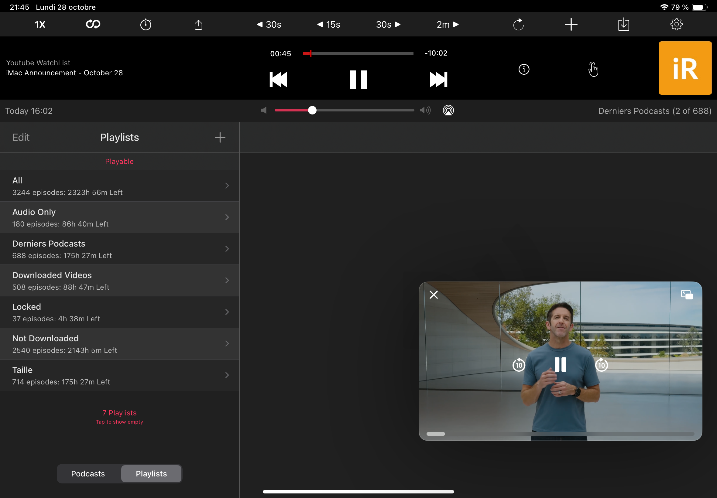
One of the main issues with YouTube’s custom PiP is that the video window is smaller and cannot be moved to any corner of the screen. In iOS’s standard PiP, users can resize and freely reposition the video, which makes multitasking easier. YouTube’s version limits users to a fixed, smaller screen size in a specific spot, which reduces the flexibility PiP is supposed to offer.
2. Controls in an Ugly Dark Gray Bar
Instead of the clean, minimalist controls found in iOS’s standard PiP, YouTube’s PiP has controls located underneath the video, in a dark gray bar that feels out of place and visually disruptive. This dark bar makes the UI look cluttered and takes away from the video content by drawing unnecessary attention to the controls.
3. Inconsistent Control Position and Options
In the standard iOS PiP, controls are minimal and in a fixed, intuitive location on the video overlay. YouTube’s in-app PiP, however, changes this by placing controls below the video. Users need to adjust to this unusual placement, which creates friction and disrupts the intuitive experience of PiP. Additionally, the lack of clear control icons can make it harder for users to quickly understand their options.
4. Different Forward and Rewind Durations
Another inconsistency is that YouTube’s custom PiP has different forward and rewind values (30 seconds instead of iOS’s standard 10 seconds). These mismatched values break user expectations and make it harder for users to control playback precisely. For viewers accustomed to iOS’s 10-second intervals, this 30-second difference is disruptive and requires more attention to get to the desired playback point.
Why Deviating from Familiar Patterns Hurts the User Experience
This situation with YouTube’s PiP highlights an important principle in UI/UX design: the more a design aligns with OS-native elements, the more likely it is that users will immediately understand how to interact with it. YouTube’s choice to bypass standard PiP interrupts this smooth, predictable experience, putting users in a position where they have to relearn basic controls, causing frustration.
The Importance of Consistency in UI Design
When UI elements look and behave as users expect, they create a seamless experience. By diverging from iOS’s PiP standards, YouTube’s design forces users to reorient themselves to find controls, adjust to the smaller, fixed video size, and work around unusual playback options. These deviations, however small individually, add up to a disjointed and frustrating experience.
Lessons for Developers: Balancing Customization and Familiarity
So, what can developers learn from YouTube’s in-app PiP decision? Here are a few best practices for balancing customization with familiarity in app design:
- Stick to OS-Native Elements When Possible: Familiar patterns improve usability by letting users navigate with confidence. Using standard PiP controls, for example, would provide YouTube users with a more intuitive experience.
- Enhance Existing Features Rather Than Reinventing Them: If you want to customize features, focus on adding new functionality rather than overhauling widely understood controls. Custom gestures or subtle interface enhancements are better ways to add unique elements without disrupting the familiar experience.
- Keep Controls Aesthetic and Functional: An attractive design is important, but not at the cost of functionality. Custom controls, if necessary, should blend into the app’s design without standing out as visually disruptive, as with YouTube’s dark gray control bar.
- Test for User Frustration: Conducting user testing can reveal where users get stuck or confused. This feedback can reveal problem areas before release and help developers refine their UI/UX to benefit actual users.
Keep It Simple for Consistency, User Comfort, and Aesthetics
At the end of the day, simplicity should be the guiding principle behind app design. Overly complex or custom controls can alienate users and create barriers to engagement. YouTube’s in-app PiP demonstrates how a useful feature can be rendered frustrating and impractical by ignoring this basic principle.
For developers, the lesson here is clear: when it comes to user experience, keep it simple. Focus on delivering an intuitive and visually appealing design that lets users focus on the content, not on finding controls. After all, the simplest solutions often make the most impact—and keep users coming back for more.
Need Help With Your Streaming Project?
This article was written by experienced professionals available through iReplay.tv. Whether you need expertise in ios mobile development developer ui ux user experience user interface swift mobile native app application store—our network of specialists can bring your project to life.
Hire a Professional →